TB12 Sports
As TB12 prepared to revamp its site and expand its nutritional product line, the product team needed to increase visibility and conversion on subscription based purchases. The work had two parts: identify where customers were running into friction finding subscription options, and translate those findings into clear navigation recommendations to inform a broader website redesign.
While specific results are protected under NDA, the improvements to page scanning and product findability led to an increase in subscription traffic and a higher share of overall business coming from subscriptions.

My Approach
To uncover where users were hitting friction and where the design could better support discoverability, I recommended a multi method research approach:
Card sorting to inform a more intuitive navigation structure on the homepage, grounded in how users actually grouped and expected to find products.
Moderated usability testing to observe real users searching for subscription products, surfacing specific pain points in the path to purchase.
Heuristic analysis to evaluate the existing interface against established usability principles, identifying issues independent of user testing.
Together, these methods triangulated qualitative and evaluative insights, giving the team a clear, evidence backed set of recommendations to guide the navigation and broader site redesign.
My Roles
UX Researcher
UX Designer
Tools Used
Figma
Optimal Workshop
Card Sort Study
To build the card set, I pulled headings and subheadings directly from the existing TB12 navigation bar. Before testing, I standardized the language across all cards to remove any linguistic patterns that might lead participants to sort by phrasing rather than meaning, ensuring the results reflected genuine mental models rather than surface level word association.
Participants
12 Participants
Participants should have an active interest and participation in health, fitness, and nutrition.
methodology
Moderated open card sort.
Unmoderated open card sort.
Usability Testing
The usability sessions focused on two core tasks: assessing participants' ability to locate subscription products on the site, and observing how easily they could add those products to their cart while purchasing the product as a subscription. Three participants of mixed ages and genders took part, conducted in tandem with the card sort study to build a more complete picture of the subscription discovery experience.
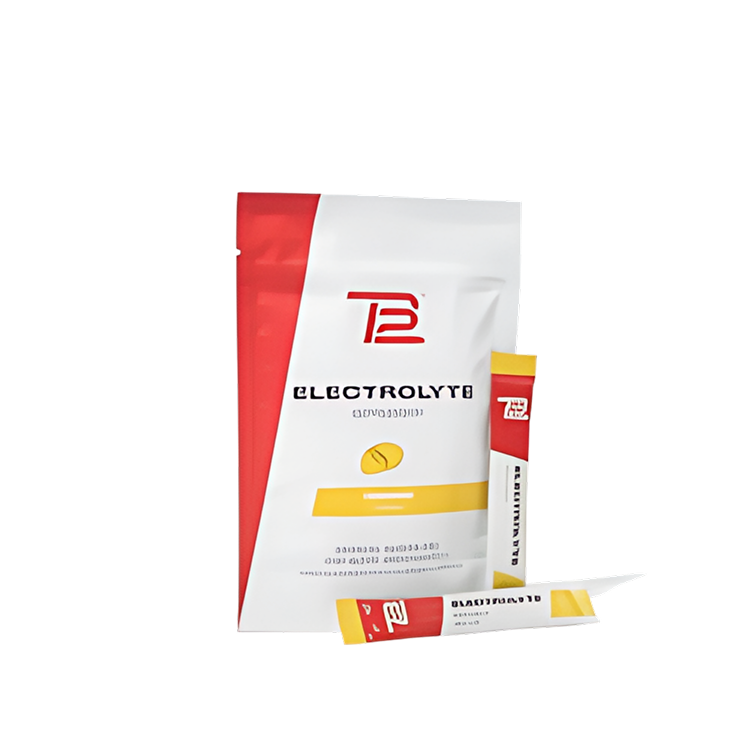
Task: Find “electrolyte powder 15-count pack” and add to your cart as a subscription.

Participants
3 Participants.
30 minute testing sessions conducted over Zoom.
Mixed ages and genders.
methodology
Moderated tasked based 1:1 usability interviews.
Participants were asked to think out load while they completed tasks.
Research Results & Recommendations
What We Found
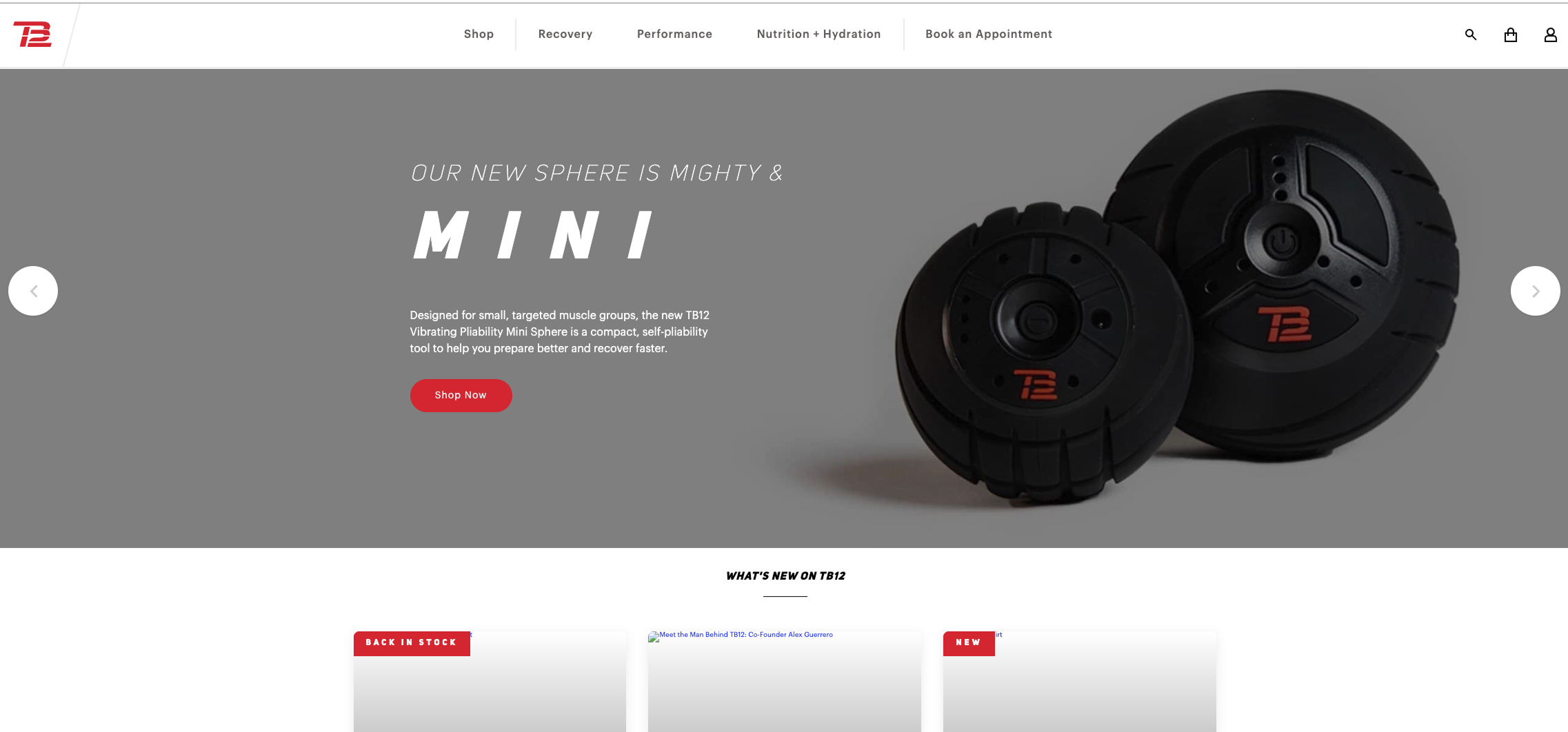
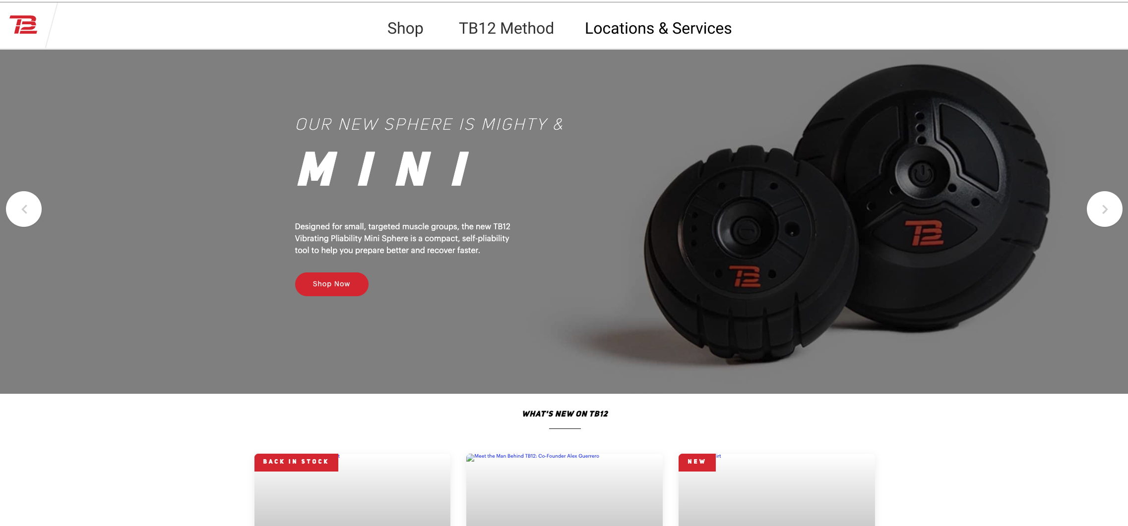
Across both studies, a clear pattern emerged: users consistently navigated to content headings like "Recovery" and "Performance" expecting to find products there, rather than going directly to "Shop." When they did reach product pages, two out of three participants scrolled past the product they were looking for, suggesting that product names weren't visually distinct enough to anchor a scan. A secondary finding flagged that users who accessed products through "Quick View" were not shown subscription purchase options, a gap that didn't surface directly in testing but represented a meaningful point of friction in the purchase path.
Recommendations
The research pointed to three clear opportunities: restructure the navigation bar to separate products, content, and services into distinct headings that match user expectations; improve the scannability of product pages through stronger visual hierarchy on product names; and standardize the purchase experience across both Quick View and full product pages so subscription options are always visible regardless of how a user arrives at a product.